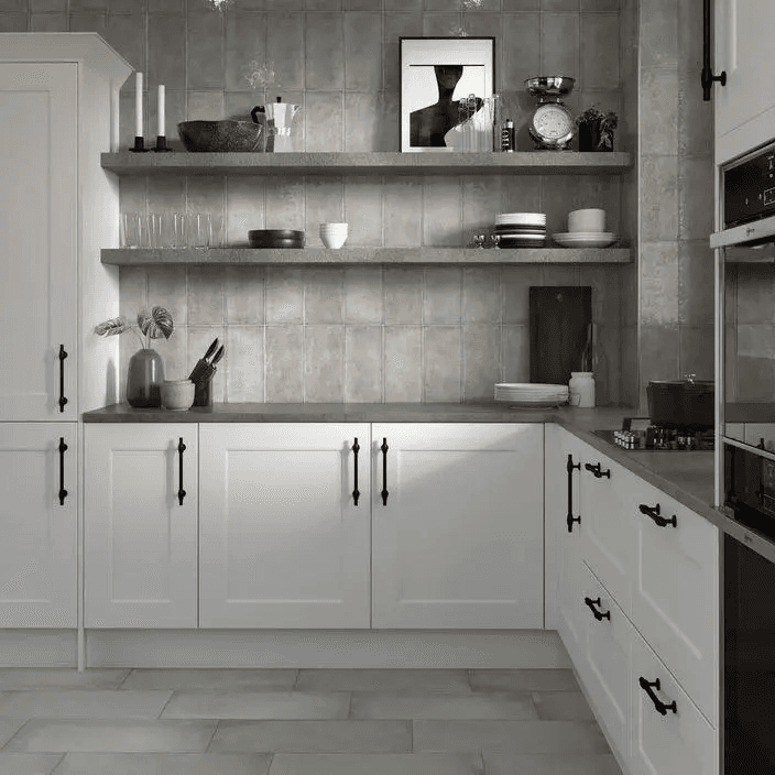
White cabinets create a bright, clean, and flexible foundation for almost any kitchen. They can make a room feel larger, lighter, and more timeless. Still, the final look depends on the details around them.
A kitchen backsplash is one of those details. It can blend softly with the cabinets, create contrast, or add a personal accent to the room. For Richmond homeowners, the right color can make the difference between a kitchen that feels simple and one that feels complete.
Because there are so many colors, finishes, and patterns available, the choice can feel overwhelming. These backsplash ideas will help you compare classic, bold, soft, and textured options while keeping the full kitchen design in mind.
ECG of Richmond can help homeowners review samples, compare materials, and choose a backsplash that works with white cabinetry, countertops, lighting, and the overall style of the home.
Classic Neutral Backsplash Colors
Soft White
Soft white is a safe and elegant choice for white cabinets. It creates a seamless look and keeps the kitchen bright without adding strong contrast.
This option works especially well in smaller kitchens or spaces with limited natural light. A slightly warm white, handmade finish, or textured tile can add depth while keeping the design calm and balanced.
Light Gray
Light gray offers more definition than white while still feeling neutral. It pairs well with stainless steel appliances, brushed nickel hardware, and many countertop colors.
Gray also works across different kitchen styles, from traditional to modern. It is a practical option for homeowners who want a polished look without making the backsplash the main feature.
Beige and Taupe
Beige and taupe bring warmth into a white kitchen. These shades are useful when the space includes wood flooring, cream countertops, brass hardware, or warmer wall colors.
They also make white cabinetry feel softer and more inviting. For many Richmond homes, warm neutrals create a comfortable design that does not feel cold or too plain.
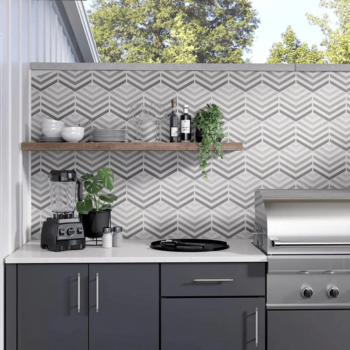
Bold and Contrasting Colors
Navy Blue
Navy blue creates a strong but classic contrast. It adds depth and can make the kitchen feel more custom.
This color works well with white cabinets, light counters, and gold or black hardware. To keep the room balanced, navy is often best when paired with simple tile shapes and clean surrounding finishes.
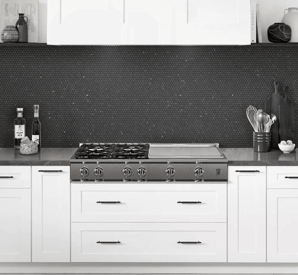
Black
Black brings a sharp and modern appearance to the kitchen. It can make white cabinets look more defined and architectural.
This choice works best in kitchens with good lighting. Matte black, glossy black, or black tile with subtle texture can all create a dramatic result without making the space feel too heavy.
Deep Green
Deep green adds color while still feeling natural. It pairs well with wood accents, brass hardware, and neutral countertops.
This shade is a good choice for homeowners who want a rich look but do not want a color that feels too bright. It can also make white cabinetry feel more grounded and sophisticated.
Soft and Subtle Pastels
Light Blue
Light blue creates a fresh and airy feeling. It is a good option for homeowners who want color but still prefer a soft look.
This shade works well with white cabinetry, light counters, and relaxed interiors. It can also support coastal, cottage, or transitional kitchens without feeling overly themed.
Soft Green
Soft green gives the kitchen a calm and natural mood. It works especially well with plants, wood tones, and warm neutral details.
This color can make the room feel more welcoming while still keeping the design light. It is one of the more subtle backsplash ideas for homeowners who want personality without strong contrast.
Blush or Warm Pink
Muted blush can add warmth and character to a white kitchen. It works best when used carefully with simple cabinets, soft lighting, and refined finishes.
Instead of choosing a bright pink, look for a muted tone that feels warm and elegant. This keeps the color from feeling too trendy.
Patterns, Tiles, and Textures
Subway Tile
Subway tile remains a popular option because it is clean, simple, and easy to adapt. It can be used in white, gray, beige, or soft color tones.
The layout can also change the mood. A stacked pattern feels modern, while a traditional offset layout feels more classic.
Herringbone
Herringbone adds movement without needing a bold color. It is a strong option when homeowners want more visual interest but still want the room to feel balanced.
This pattern works especially well in neutral colors. It can make a simple backsplash look more detailed and custom.
Large Format Tile
Large format tile creates a smooth and minimal surface. It uses fewer grout lines, which can make the wall look cleaner and easier to maintain.
This option works well when countertops already have strong veining or pattern. It helps the backsplash support the design instead of competing with it.
Natural Stone
Natural stone adds texture, movement, and a more organic look. Marble, travertine, and other stone options can create a warm and high-end result.
These backsplash tiles can look beautiful with white cabinets, but they may need sealing or more careful maintenance. ECG of Richmond can help homeowners compare stone options before making a final choice.
Tips for Choosing the Right Backsplash Color
Check the Lighting
Lighting can change how tile looks. A color that appears warm in a showroom may look cooler at home.
Test samples in your kitchen during the day and evening. This helps you see how the color works with natural light, cabinet lighting, and overhead fixtures.
Compare With Countertops
The backsplash should support the countertop. If the counter has bold movement, choose a calmer backsplash. If the counter is simple, the backsplash can carry more texture or color.
A balanced design usually works better than several strong elements competing for attention.
Match the Cabinet Undertone
Not all white cabinets are the same. Some are bright white, while others are creamy, warm, or slightly gray.
Choose a backsplash color that matches the undertone. Warm whites often pair well with beige, taupe, or soft green. Cooler whites often work better with gray, blue, or crisp white.
Get Expert Guidance
A kitchen backsplash should look good, clean easily, and fit the home long term.
ECG of Richmond can help you compare colors, finishes, materials, and installation options. With expert guidance, you can choose a backsplash that makes your white kitchen feel finished, balanced, and personal.